4 Ways Great UX Drives Product-Led Growth
Discover how exceptional UX drives Product-Led Growth. Learn key strategies that enhance user engagement, retention, and conversions in SaaS and apps.

At the backbone of every product-led strategy, is a try-before-you-buy philosophy. How often have you tried a sample from a bakery shop before purchasing? How many perfume testers have you sprayed before you knew instantly what to buy? Once you engage with a product you like — whether tasting, smelling, or using it — the desire to own it often becomes irresistible.
Similarly, Product-led Growth (PLG) revolves around letting consumers experience the product and as a result, inform how all areas of that product or business function. This approach helps potential users set their expectations right in a low-risk fashion, from free trials, demos, and online samples, mirroring the traditional sensory experiences. Whether through virtual tours, software trials, freemium, or digital downloads, the essence remains: enabling consumers to experience a product's value firsthand.
Attracting and converting customers in the software market has become more challenging than ever. Many are turning to product-led growth as a competitive strategy, where the product takes the lead, and hopefully, sells "itself".
PLG empowers the product itself to be the primary driver of customer acquisition and retention. Far from being a buzzword, creating compelling user experiences (UX) that seamlessly guide users through the product journey is a must in SaaS and apps. Not only that, but UX serves a vital role in mitigating the substantial risks associated with implementing a product-led growth strategy.
In this article, we'll explore four ways great UX drives product-led growth, showing how a user-centric approach can lead to higher retention, better engagement, and ultimately, more conversions.
How Great UX Shapes Product-Led Growth
For both UX & PLG, conveying product value to first-timers in the least amount of time is critical (Time to value). From a general understanding of online consumer behaviour, consumers tend to compare several options before making a purchase. Therefore, if users don't grasp the product's value quickly, they're likely to leave for the next similar product offering. And as more and more competitive, similar tools are launched, the race to acquire and convert visitors is harsher by the day. Users' tolerance for cumbersome initial experiences has decreased significantly, adding to the challenge.
So if tools are now offering the same things, have similar features, solve the same problems & compete on similar segments & pricing, what could make them stand out from the crowd you ask? Great user experience.
Some of the most successful tools that you probably use and love are made by designers, multi-million dollars companies such as Airbnb, Linear, Kickstarter, Pinterest & Etsy just to name a few. These tools are able to grow exponentially because they stem from a deep understanding of user behavior & needs, with a product-first mindset.
Here are 4 ways UX drives successful adoption in a product-led growth model :
1️⃣ Reducing time to value
The perceived value and the actual value are two different things. As users engage with your product, the goal is to bridge any gap between these two. If a significant disparity continues, it is likely a communication mismatch in how the product's benefits are conveyed.
One of the main goals of the try-before-you-buy approach is communicating the product's value compared to users' assumptions, by letting them experience firsthand how well your product can solve their problem. Design is at the front row of this communication, ensuring that every interaction reinforces the product's benefits and usability, guiding users towards a confident purchasing decision.
Ahead App:
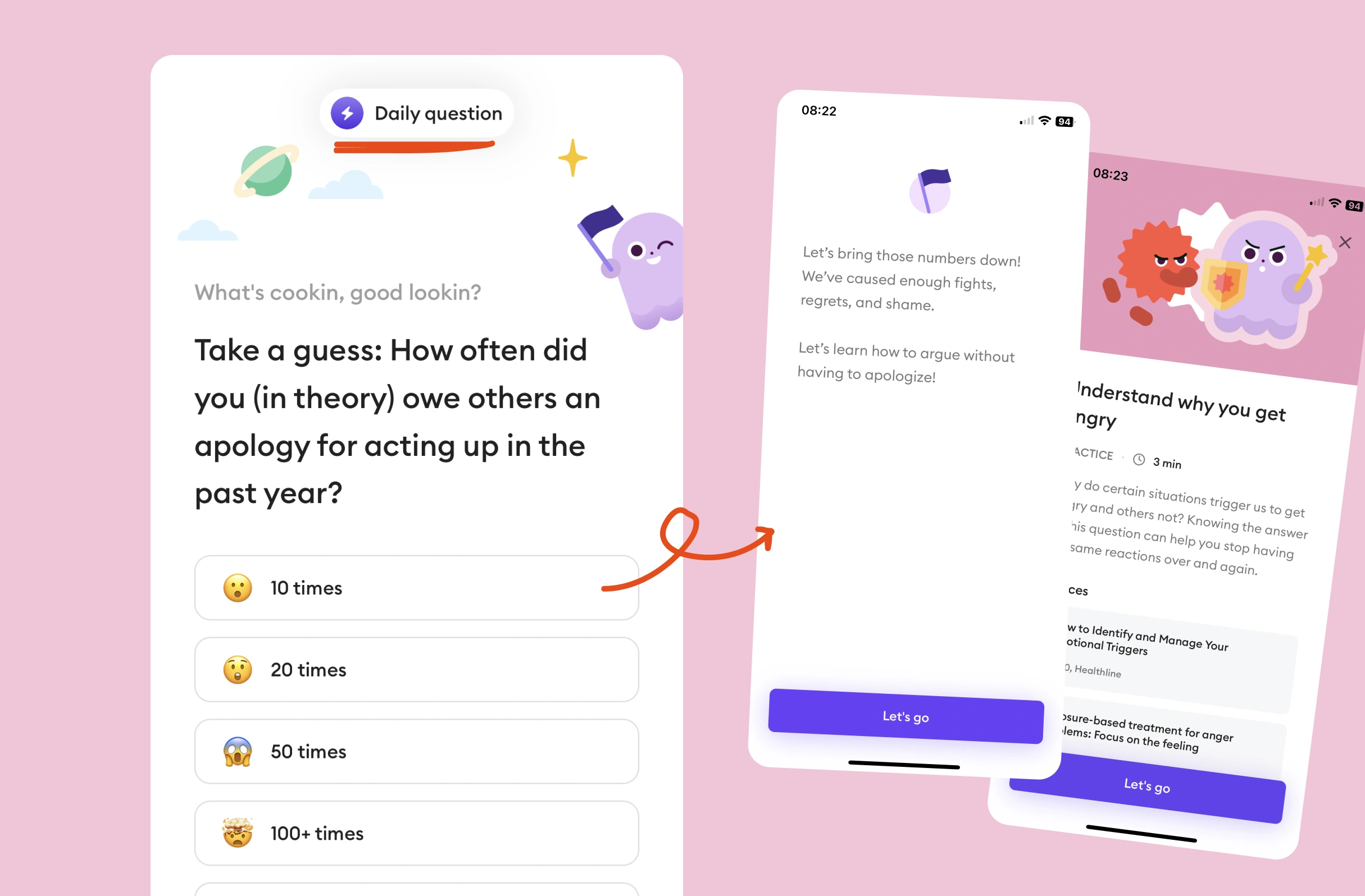
When you open Ahead, a simple daily question prompt welcomes you, seamlessly transitioning into a relevant lesson. Effectively reducing time-to-value to a single click, positively influencing the perception of value and maintaining user interest. By consistently reminding users of the app's benefits, this approach can also help reduce churn rates.
✅ What worked :
- Reducing time to value down to a single click
- Enticing users' curiosity gap with a thought provocative question
- Positively influencing the perception of value
- Reduce churn rate by reminding users of the benefits
MIMO:
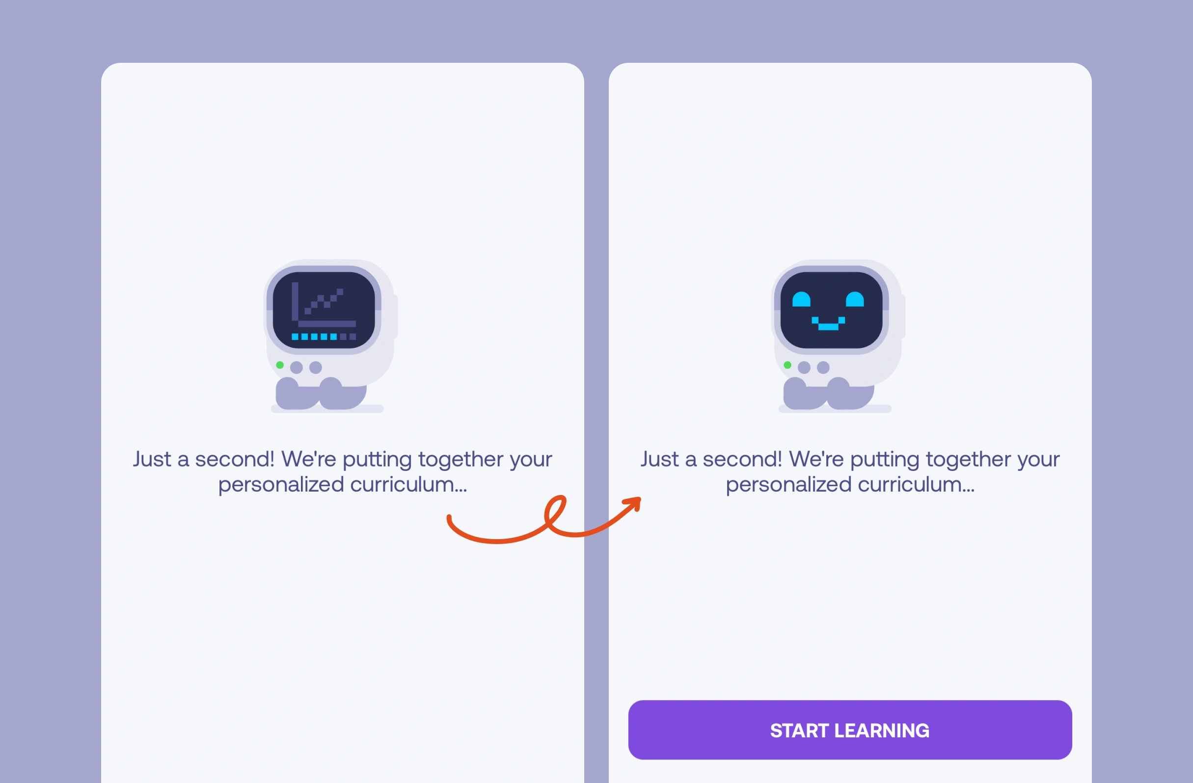
By applying the labor illusion effect, Mimo gives its users a higher value perception by showing them that what their going to experience is personalized.
2️⃣ Increasing conversion rates
Great UX helps convert free users to paid customers by making the product's value immediately clear and easy to experience. A smooth onboarding process quickly demonstrates core features, enticing users to explore more. An intuitive design reduces frustration, ensuring users can easily access premium features that highlight the benefits of upgrading.
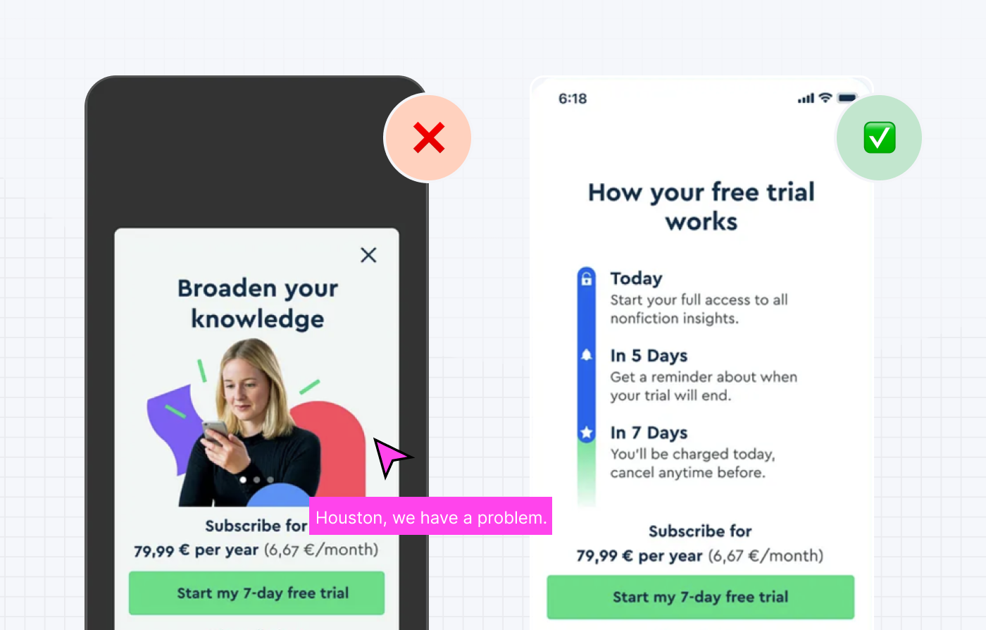
BLINKIST:
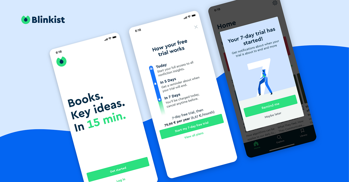
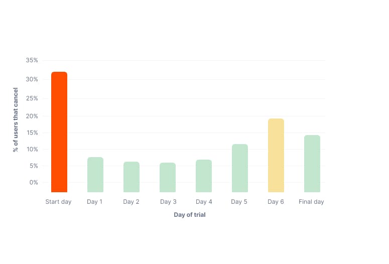
Blinkist tackled a major challenge by introducing a new variation of their paywall, after noticing that some of their customers were hesitant to subscribe to their 7-days free trial. In fact, 33% of cancellations are done right after users start their trial.
The challenge was to ensure users felt secure when starting the premium trial by letting them know they will be charged at the end beforehand. After collecting user feedback (email, Google Play and App Store reviews..), they found that most users who did sign up to the trial, would cancel on the first day. The top reason being that users had a fear of forgetting to cancel and being charged.
As a result, the design solution brought more transparency to the trial paywall flow. They also introduced a new email & notification push to let them know when they will be charged.
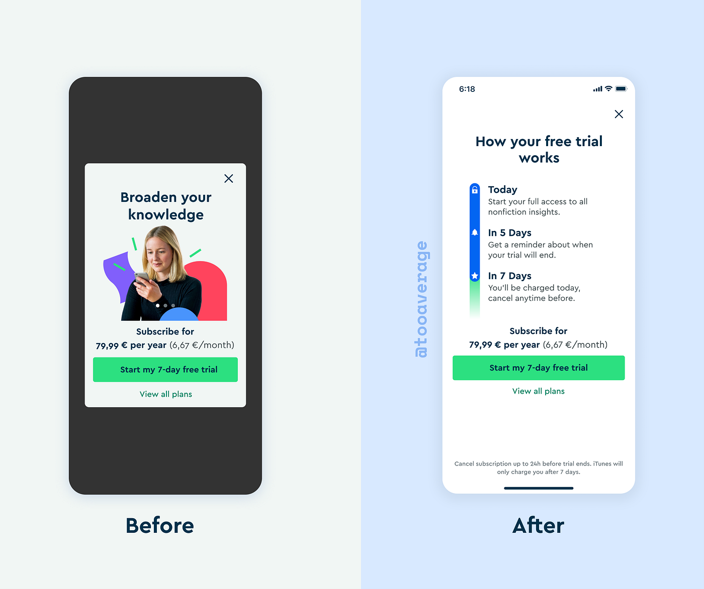
✅ What worked :
- Prioritized full transparency, nothing more, nothing less.
- This new layout reduced cancellations by 4%
- Increased sign-ups by 23%
- Reduced customer complaints by 55%
- Increased push notification opt-in from 6% to 74%
GOALQUEST:
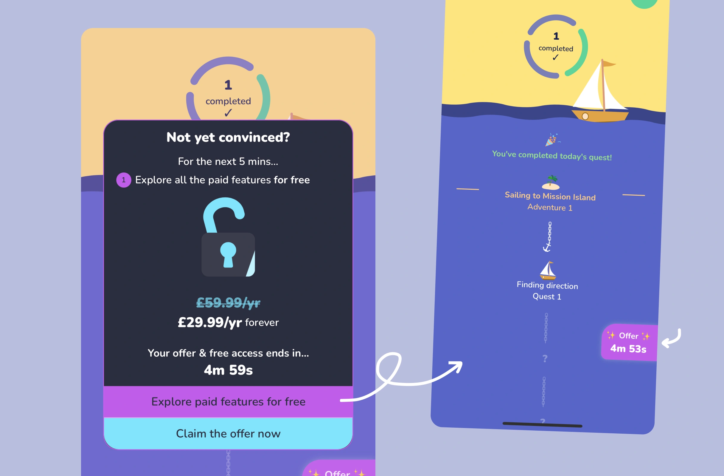
GoalQuest introduced scarcity by offering limited-time access (available for just 5 minutes) to encourage users to explore the features, emphasizing a "now or never" effect. This approach reframes the experience as a value-hunting adventure while providing complete access to all paid features.
✅ What worked :
- Using positive scarcity to encourage users to explore paid features
- Framing as a "value-hunting" adventure
3️⃣ Minimizing Friction at Acquisition
The acquisition stage is where it all begins. This is where users first encounter the product. For any features available to a new user, a product designer's main goal is to guide them into understanding these benefits and quickly realizing the product's value. This involves prioritizing the features most likely to convince users to stick around. One of the most crucial metrics for first-time users is the number of high-value moments they experience.
In onboarding new users for example, the goal is to encourage users to complete only the most important tasks, necessary for them to experience the product value.
LOOM:
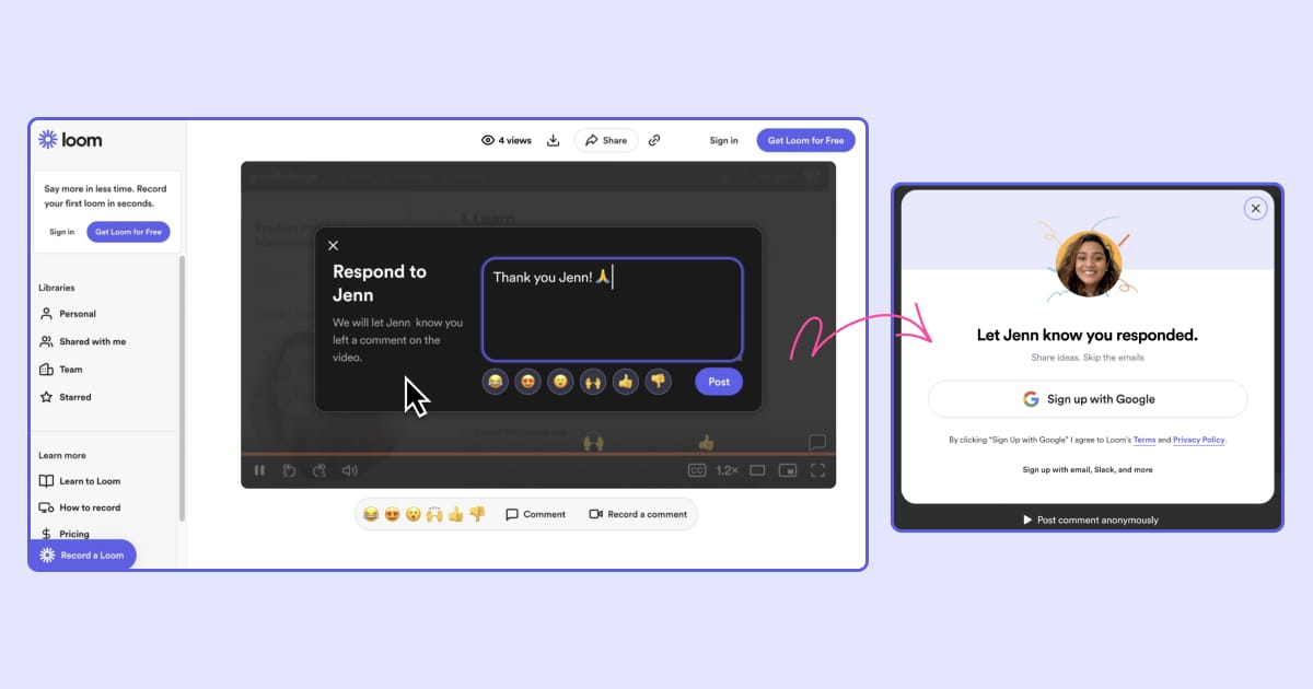
Loom hits the nail on the head when it comes to acquiring new sign-ups. By employing both retention and acquisition loops, Loom grew from 500k users in 2018 to 21 million as in 2023.
When existing users make a video via loom and send it to someone in their network, they do many things right and truly showcase their understanding of their user base. For example, upon opening the link, the video is automatically shortened and sped up to 1.2x to make it just quick enough to save time, without it being too fast.
Another effective tactic is prompting users with a suggested response when a video finishes, reducing effort and leveraging the reciprocity principle. When users receive a video, they naturally want to thank the sender. Loom facilitates this by encouraging comments and sign-ups, leading to a 13% increase in comments on all Loom videos.
✅What worked :
- Speeding up videos to save time and minimize the perceived effort without is being too fast (Labor perception bias)
- Enticed users' curiosity by showing previous reactions from others
- Place triggers at the right moment for users to self-initiate, which made them more likely to interact with (such as reacting to a specific moment in the video)
- Used the reciprocity principle to encourage sign-ups (after delivering the products' value)
- Increase of 13% in comments on all loom videos.
4️⃣ Reducing user churn & improving retention rates
Another way great UX merges into a PLG strategy is through introducing ways to reduce churn & keep users engaged. There's no magic spell here, it comes through the same means of understanding what makes users stick, and what makes them leave.
Both quantitative & qualitative analytics are crucial for identifying segments that may signal potential churn, such as users gradually reducing their interaction with the product. Understanding why users stay or leave is key—whether due to unmet expectations, poor adaptation to their needs, or overall dissatisfaction.
OPAL:
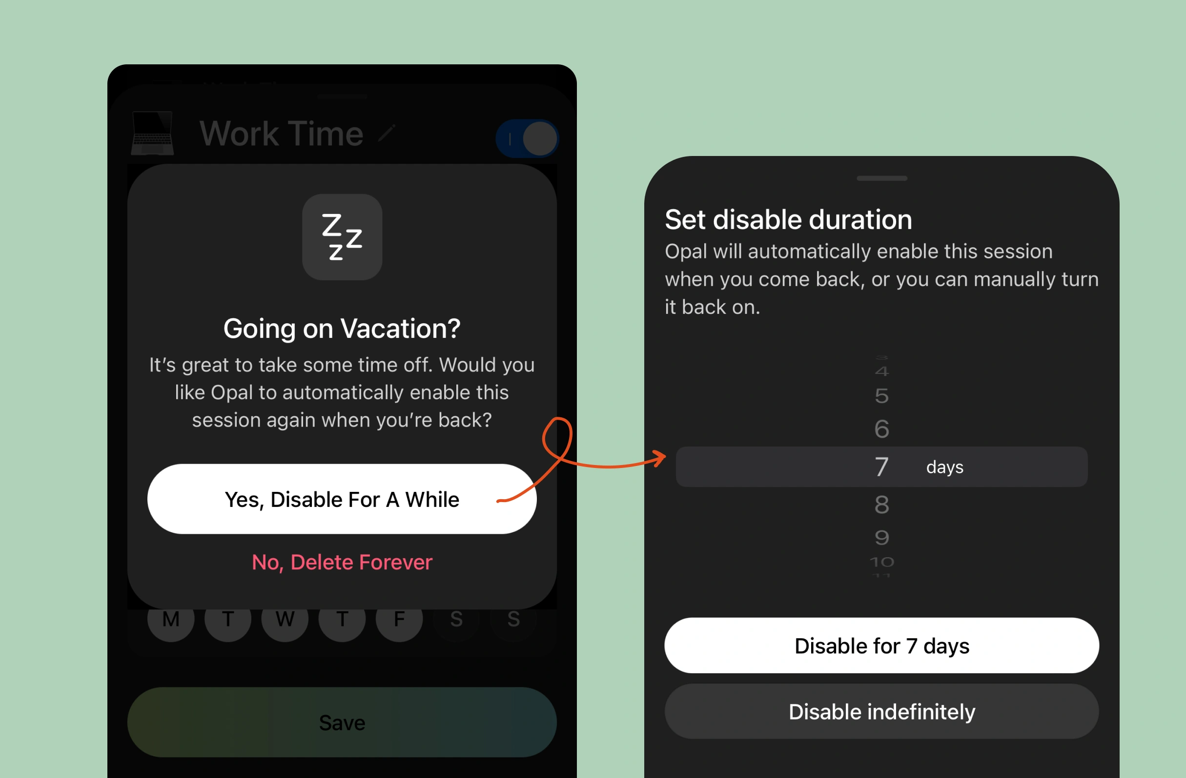
When trying to delete a focus session, Opal suggests temporarily disabling it instead, especially if you're going on vacation. This simplifies setting it up again when you resume, potentially reducing churn when users return from vacation and prefer not to reset their sessions.
✅What worked :
- Adapting user workflows to their lifestyle & context, e.i. recognizing that people can go on vacations.
- Make it easier for users to set things back up if they want to resume a focus session.
- Likely reduced churn.
FINCH:
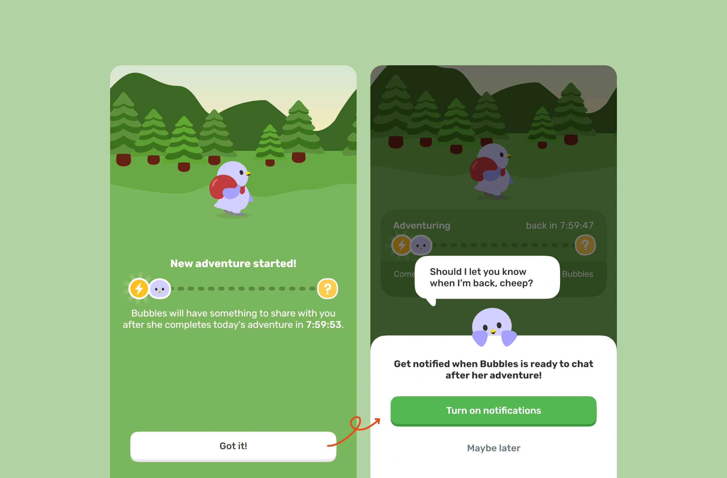
To entice users' curiosity, Finch sends its bird mascot on an adventure to collect a daily reward, using this time to prompt notification permissions. By doing so, it creates a curiosity gap that sustains interest and encourages users to return later, rather than immediately deleting the app. Moreover, It's a great way of prompting for notification permissions.
✅What worked :
- Using the curiosity principle to keep users interested.
- Increase notification opt-ins.
MORNING BREW:
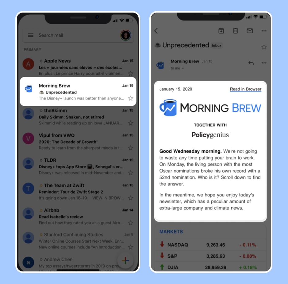
Morning brew is a newsletter that delivers business news in a "Bite" format. They have one the highest open rate in the business (~40%+), and they don't leave anything to chance.
They regularly A/B test their subject lines by releasing batches of emails at different times. The intro email does a great job of keeping a friendly tone (imagine you just woke up from 7 hours sleep and want to ease yourself into the day), and effective open loops (the equivalent of cliffhangers for copy). In fact, Open loops have shown to be effective in increasing activation rates, by triggering a desire to search for the missing pieces of information.
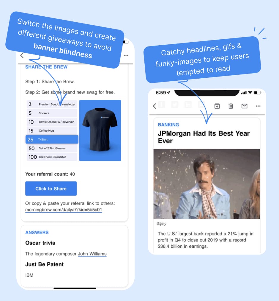
Morning Brew is renowned for its captivating headlines, engaging GIFs, and unconventional images that keep readers hooked, even when the topics are serious or potentially boring. They understand that their audience is likely reading in the morning, a time when focus hasn't fully peaked. This design approach highlights a deep understanding of their readership.
Additionally, it's notable that Morning Brew's referral program accounts for 30% of their audience base. They consistently include reminders about the referral program in their newsletter, sparking readers' curiosity by highlighting potential rewards. To avoid banner blindness, they frequently switch up the images and giveaways.
✅What worked :
- Morning Brew's email stands out from a sea of other bland emails.
- They keep a friendly & casual tone with their readers, and tease about many subjects to come (priming)
- Using captivating headlines and imagery, along with a well-organized structure to keep content easily digestible.
- Morning Brew has experienced rapid growth thanks to their high-quality content delivery, well-structured format, and strategic use of design to stand out.
- 40% open rate & 30% of their audience base comes from their referral programs.
Wrap-up
Great UX is the cornerstone of successful product-led growth strategies. By focusing on user-centric design, businesses can ensure that their products are intuitive, engaging, and valuable from the first interaction. This not only attracts new users but also retains them, reducing churn. Ultimately, investing in exceptional UX is not just beneficial—it's essential for driving sustainable growth in today’s competitive markets.
I'd love to hear your thoughts in the comments! What is a product whose UX really impressed you & kept you hooked and why? Do you have any success stories where great UX significantly boosted product's growth? 💬