Behind the Click: 44 Cognitive Biases in User Experience Design for Better Conversion

Every click, scroll, and conversion is a result of the fascinating intricacies of the human mind. Learn how to elevate your user experience while increasing your conversion rate.
Psychology plays a pivotal role in creating interfaces that resonate with users. The cognitive aspects of user experience—where perception, attention, and memory influence design choices. Interestingly, even the smallest of changes, such as the color of a button, can significantly impact your conversion rate (think of the 300 million dollar button).
For UXers and growth lovers alike, user empathy is key. Sure, the focus is widely different, but the objective remains the same. For both, the foundation of success lies in recognizing user needs and creating experiences that resonate and leave a lasting impact.
Whenever users engage with your product, they assess and sift through the presented information, search for the underlying meaning, respond or take action within a specified timeframe, and retain fragments of the interaction in their memories. Therefore, to enhance your user experience, it's important to comprehend the biases and heuristics influencing each of those four stages in the decision cycle.
Understanding the Decision Cycle: Where Psychology Guides User Actions
The journey begins with an exploration of how cognitive processes impact user experiences through the four stages of interaction. From the way users perceive information to how their attention is captured and retained, the psychology of user experience plays a pivotal role in creating interfaces that feel easy to engage with.
Stage 1: Users assess and sift through the presented information
Consider the analogy of a bookstore where readers assess book covers, read blurbs, and sift through genres before choosing a book. In the same way, when users see ads or visit websites, they're starting to decide what to do. They go through the information available, forming ideas that affect what they do next. It's like when a reader decides which book to look at more closely. This initial stage is akin to the critical moment when a reader decides which book to explore further.
🗃️ #1 Cognitive load
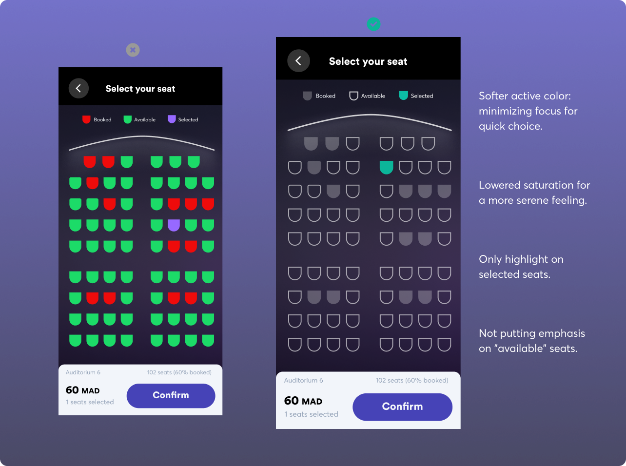
Cognitive load is about how much thinking and remembering users have to do. When there's more information than the user can handle, the cognitive load becomes too much to manage. Too little can make the interface dull, while too much can overwhelm and frustrate users, possibly causing them to give up on the task.
For example, you can minimize task perception in a new form by breaking down fields into separate steps makes it seem easier for the user to complete. Or experiment with lighter and darker active colors, reducing attention to a quick choice.
🤔 #2 Hicks Law
Hick's Law says that more choices make decisions take longer. So, keeping things simple and not giving too many options helps users decide faster. Having too many choices available can lead to the paradox of choice.
How often do you open Netflix and find yourself watching trailer after trailer? Similarly, opening a menu with too many items can slow down decision-making. A menu with categories or a few choices speeds things up. A pricing page with too many price points that take more than 5 seconds to grasp can make a user stuck.
🪖 #3 Priming
Priming consists of subtle visuals that influence how we respond. Priming is when what you see first affects how you act next. It means setting expectations for users.
For example, adding a cheerful train landscape allows users to imagine their upcoming journey, boosting the likelihood of a positive experience.

🫸🏻 #4 Nudge
A nudge is a gentle push in design that helps users do what you want them to do without telling them directly. Think about gently guiding users before making steps mandatory.
💦 #5 Progressive disclosure
Progressive disclosure is about showing information bit by bit instead of all at once. It helps users take in information without feeling overwhelmed. Guiding users to progress from easy tasks to more complex ones reduces the likelihood of them feeling overwhelmed.
👩🦯 #6 Banner blindness
Banner blindness refers to users ignoring or overlooking banner-like information or advertisements on a webpage due to habitual exposure. To this effect, users tend to ignore content that looks like ads, is near ads, or is placed in areas typically reserved for ads.
👯♂️🕺 #7 Decoy effect
The decoy effect occurs when choosing between two options is influenced by adding a third, less appealing option (the decoy).
Decoys are "asymmetrically dominated," meaning they are significantly worse than one option (the target) but only partially worse than the other (the competitor). This is why it's also known as the "asymmetric dominance effect.
💄 #8 Aesthetic-Usability Effect
A psychological phenomenon where users perceive more aesthetically pleasing and visually attractive designs as more usable and effective, even if the functionality remains the same. In simpler terms, users tend to associate a visually appealing interface with higher usability and better performance.
🖼️ #9 Framing
The deliberate presentation of information or choices to influence users' perceptions and decisions. It's about shaping how content is displayed to guide users toward specific understandings or actions.
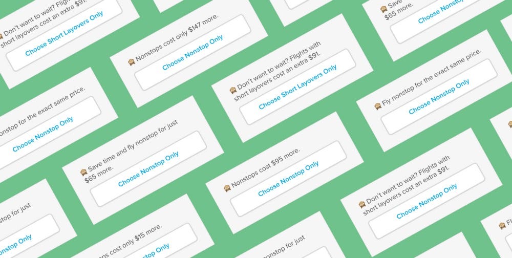
As travel platforms usually do while presenting flight options, instead of listing only the original prices, the framing would highlight discounts or savings, such as "Save 2000 Dhs" or "20% off."
A fitness app introducing a new workout program, the messaging could emphasize efficiency and achievable milestones, such as "Get Fit in Just 15 Minutes a Day." Instead of framing it as a challenging and time-consuming routine, only highlight the convenience so that users perceive the workout as manageable.
This framing not only emphasizes the positive aspect of savings but also influences users to view the options in a more favorable light.
⚓️ #10 Visual Anchors
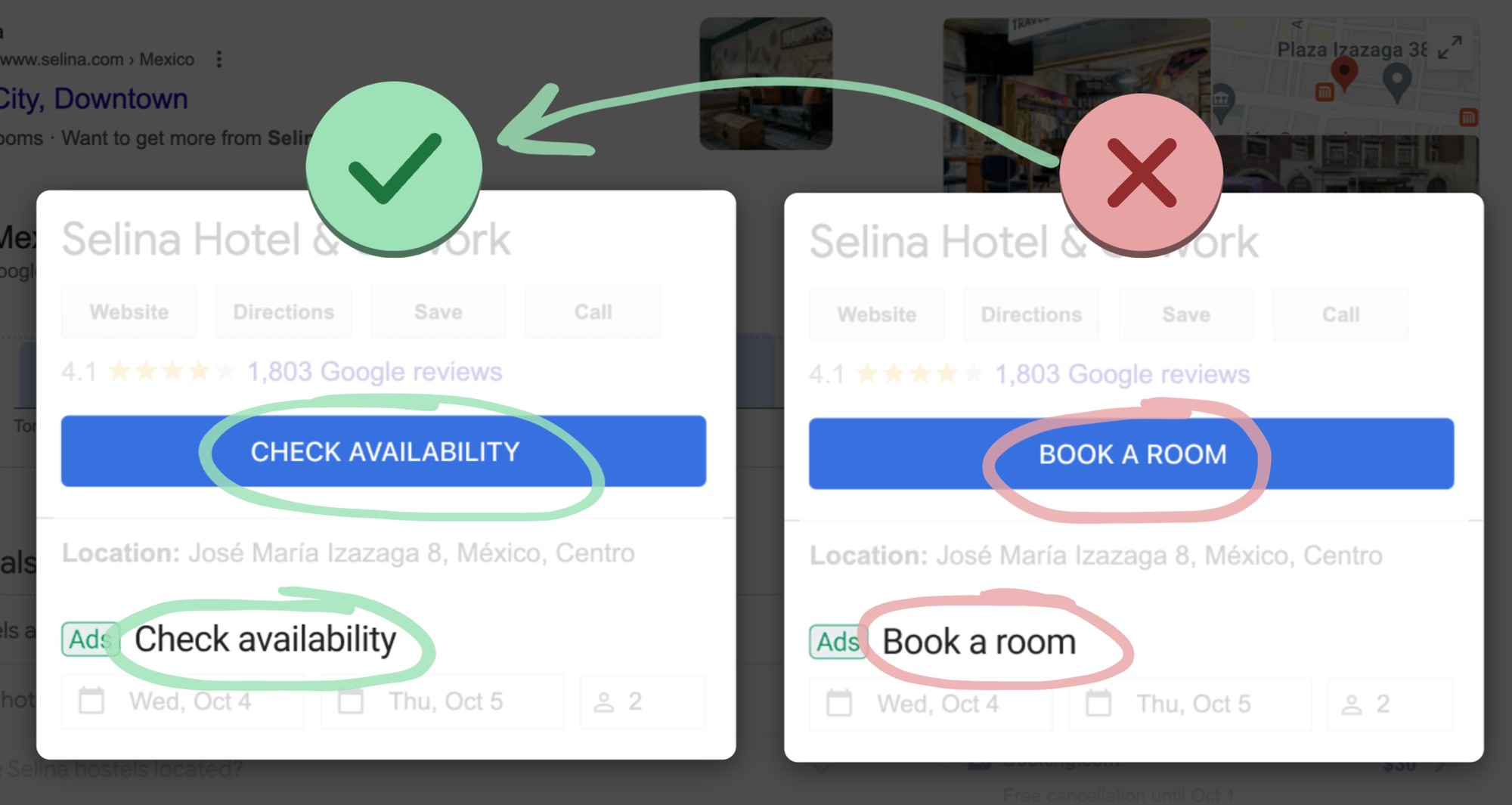
Visual Anchors refer to design elements strategically placed to draw attention, guide user focus, and create a reference point for understanding information hierarchy.
Types of visual anchors include :
- Color
- Size
- Position
- Shape
🤼♂️ #11 Law of Proximity
The Law of Proximity is a design principle that states elements placed close to each other are perceived as related or belonging to the same group.
This principle helps organize information, create a visual hierarchy, and guide users in understanding relationships between different elements.
So, avoid grouping unrelated elements closely together. Inconsistent grouping can confuse users and disrupt the logical flow of information.
Gestalt psychology is about how our brain puts pieces together to see whole things.
— Matt D. Smith (@mds) September 11, 2023
When stuff lines up in a straight line, it's called the "law of continuation," and we see it as one big thing.
✨ Use this to your advantage in UI design. pic.twitter.com/Nula7HKslQ
Stage 2: Users search for the underlying meaning
Following the same Bookstore analogy, think about readers who, after picking a book because they liked the cover, start reading to understand the story. Similarly, when people are online, they try to understand what's happening on the interface. This is like readers exploring the deeper meaning of a book's story. In the digital world, users are actively trying to figure out the context and what things mean based on what they want or expect. It's like understanding a story not just for what it is, but how it fits into what you were looking for.
🧠 #12 Mental model
A mental model refers to the representation individuals construct in their minds about how a system or product works. It includes their understanding of the system's structure, functionality, and how they expect it to behave, which might be a false representation based on how they perceive their surrounding world.
🪞 #13 Reciprocity
Reciprocity in User Experience refers to the principle that users are more likely to engage positively with a system or interface if they perceive that the system has done something beneficial for them.
Users are more inclined to interact with your product when you offer them value first. Establishing trust through value delivery increases the likelihood that users will reciprocate. This becomes particularly important when you're about to request significant actions from users, like signing up or encountering a paywall.
👨👩👦 #14 Familiarity Bias
Users tend to prefer and trust things that are familiar to them. In the context of design, users are more likely to favor interfaces, layouts, or elements that they are already familiar with, even if alternative designs might be objectively better. Therefore, incorporate familiar patterns when designing new experiences.
🤳🏻 #15 Social Proof
You've probably heard of this one before. Social Proof refers to the psychological phenomenon where individuals tend to adopt the behavior or opinions of others in uncertain situations.
It acts as a helpful shortcut for users when deciding how to behave. In uncertain or ambiguous situations, users tend to observe and follow the actions of others, considering them as correct. The more people take a particular action, the more it appears appropriate to users.
👀 #16 Curiosity gap
Gaps create discomfort. When there's something we want to know but can't, it feels like an itch we can't scratch. To alleviate this discomfort, we must fill the knowledge gap.
The curiosity gap refers to deliberately creating a gap or a sense of information scarcity to spark users' curiosity and encourage them to engage further. Consider strategically withholding certain details, enticing users to explore and discover more about the content or product.
💐 #17 Variable Reward
Refers to a technique where users receive unpredictable and varied responses or outcomes as a result of their interactions. This approach leverages the psychological principle of operant conditioning, making the user experience more engaging and habit-forming. This unpredictable schedule encourages a consistent and frequent response rate.
😲 #18 Aha! moment
The Aha moment is the specific instance when a user comprehends and appreciates the full value or functionality of a product or feature. It's the moment of realization that often leads to realizing why they need your product.
🥅 #20 Goal Gradient Effect
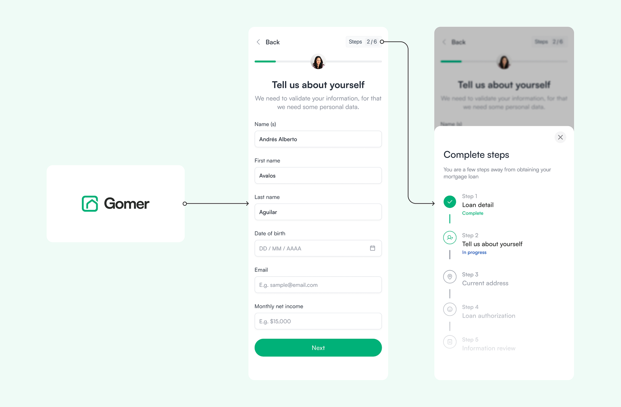
The Goal Gradient Effect refers to the phenomenon where individuals become more motivated to complete a task as they progress closer to the goal. The perception of nearing achievement increases the user's commitment and effort to reach the endpoint. So, The closer users are to completing a task, the faster they work towards reaching it.
🌓 #21 Cognitive Dissonance
Cognitive dissonance is the mental discomfort or tension experienced by users when they encounter conflicting or inconsistent information, beliefs, or actions within a system. Aim to minimize cognitive dissonance by creating coherent and logically consistent user experiences.
📚 #22 Curse of Knowledge
A cognitive bias where designers, content creators, or stakeholders, find it challenging to imagine what it's like not to know what they know. This can lead to communication issues, as they may assume users possess the same level of understanding, resulting in unclear or overly complex interfaces.
The Curse of Knowledge highlights the importance of considering users' perspectives and ensuring that designs cater to a diverse range of knowledge levels.
Stage 3: Users respond or take action within a specified timeframe
Now, into the third stage of our user journey, drawing parallels with our bookstore analogy, users move from understanding the narrative to actively making decisions, just like readers transitioning from exploring a book to deciding to buy it. Users decide to respond or take action based on what they've gathered so far. This could involve making a purchase, clicking a link, or signing up for a service.
In this stage, as busy as life can get, users prefer short and straightforward actions, mirroring their inclination to take shortcuts and quickly jump to conclusions.
🔄 #23 Investment Loops
To design elements that encourage users to invest time, effort, or resources into a product or service. These investments create a sense of commitment, making users more likely to continue engaging with the system. When users invest themselves, it makes it more likely that they'll come back.
🌊 #24 Sunk Cost Effect
We've all been guilty of this, at some point or the other. It's the human tendency to continue investing time, effort, or resources into a product or service, even if the perceived benefits diminish or the initial investment proves non-rewarding.
This behavior is influenced by the desire to justify past investments and become reluctant to pull out of something they're invested in.
🍔 #25 Temptation Bundling
Temptation bundling involves combining a desirable or enjoyable activity with a task that may be less appealing.
This technique aims to make the less enjoyable task more enticing by associating it with a rewarding or pleasurable experience.
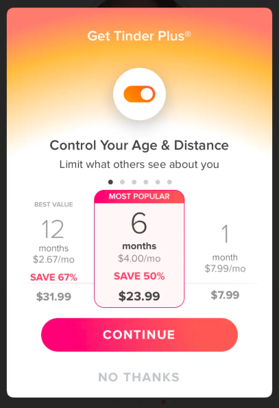
📉 #26 Descending Price Anchor
The Descending Price Anchor in UX is a pricing strategy where users are presented with a series of decreasing price options, typically starting with a higher-priced item (Starting with the highest plan on the left).
The purpose is to influence users to perceive the subsequent, relatively lower-priced options as more affordable or reasonable.
😪 #27 Decision Fatigue
The deteriorating quality of decision-making as a user is faced with an increasing number of choices or decisions. The mental exhaustion from prolonged decision-making can lead to poorer choices or even decision avoidance.
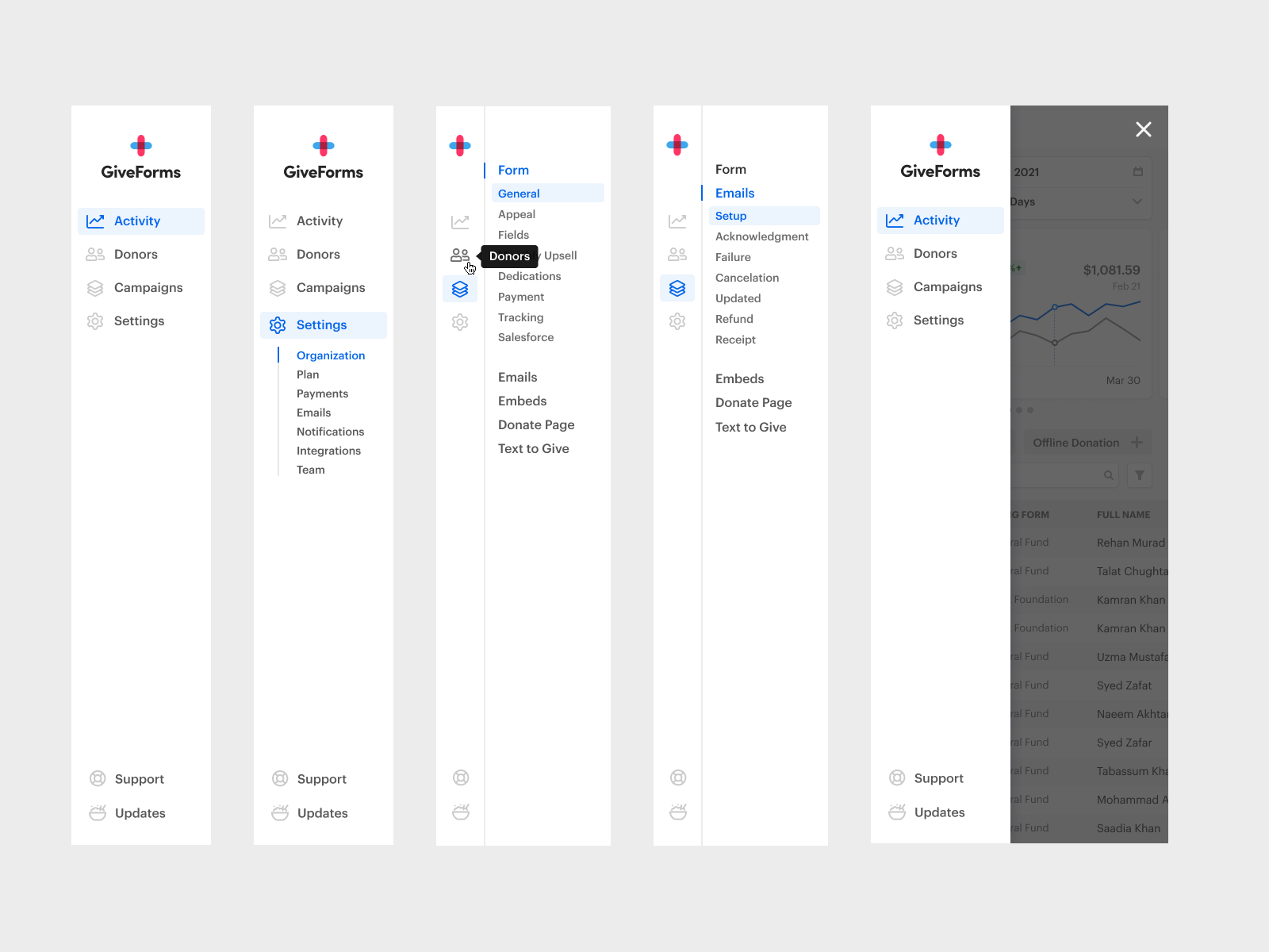
🔓 #28 Removing the "Buy" barrier
Removing the "Buy" barrier involves streamlining the purchasing process to make it as frictionless as possible.
This may include reducing the number of steps, simplifying the checkout process, and minimizing obstacles that could deter users from completing a purchase, or replacing it with a more innocent word such as "Continue".
🎭 #29 Second-Order Effect
The Second-Order Effect is the unintended or indirect consequences that arise as a result of a design decision or feature implementation.
These effects may not be immediately apparent and can impact user behavior, perception, or overall experience in ways that go beyond the initial design intention.
Nevertheless, we need to diligently anticipate the potential adverse outcomes of the experiences we design to the best of our ability.
🔎 #30 Discoverability
Discoverability refers to the ease with which users can learn about and find the features, functionalities, or content within an interface. A highly discoverable design ensures that users can easily understand and access the available options.
The #1 rule should always be to make sure people feel confident they're in the right spot, and if not, assure them they can easily find their way back.
⚒️ #31 Law of the Instrument
This bias is sometimes called "the law of the hammer" or "Maslow's hammer." It refers to psychologist Abraham Maslow's saying, "If the only tool you have is a hammer, it is tempting to treat everything as if it were a nail."
It highlights the inclination to use what one is most comfortable with, rather than exploring alternative approaches that may be more effective.
🏋️ #32 Labor Illusion
Users perceive a service or product as more valuable and worthwhile when they believe significant effort and attention to detail were invested in its creation, even if that effort is not directly visible.
This is also called the "KAYAK Effect" (based on the travel booking site that used that tactic).
Labor illusion in action to show that the AI is working hard to generate the schedule. https://dribbble.com/shots/22977365-Labor-illusion-UI-micro-animation
😸 #33 Happy Path
In UX design, the "happy path" involves creating a simplified and less challenging experience, even if it means adjusting user flows. This approach is beneficial for:
- Boosting Activation and Engagement: Simplifying the journey reduces barriers and encourages users to engage more readily.
- Increasing User Retention: When users return come back from a long pause, a simplified experience helps reacquaint them with the platform.
For instance, a fitness app that, instead of overwhelming users returning from a three-week pause, with complex workout routines, recommends a simple, relatively short, and guided workout that helps them feel better about themselves, with just a little bit of commitment to retain their involvement.
Stage 4: Users retain fragments of the interaction in their memories
Picture the reader finishing a book, closing it, and holding onto the significant moments. Similarly, users having taken action, remember fragments of their interaction. However, here lies the nuance: users want to remember what's most important, but their brains naturally prioritize certain elements over others.
After making a purchase, signing up, or navigating through a website, users retain fragments in their memories. The brain, being selective, tends to highlight specific aspects—perhaps the seamless checkout process, the clarity of information, or the overall satisfaction derived. Just as a reader recalls plot twists or memorable characters, users remember the distinct elements that stand out in their digital interactions.
🎢 #34 Peak-End Rule
Suggests people tend to judge and remember an experience based on the emotional peaks and how it ends rather than the overall average of the entire experience. This rule underscores the significance of the most intense emotional moments and the final impression in shaping users' perceptions..
⏳ #35 Zeigarnik effect
People tend to remember uncompleted or interrupted tasks better than those that are completed. This effect emphasizes the persistence of incomplete actions in memory and the impact it has on user engagement and motivation.

🗄️ #36 Chunking
Chunking in UX is like breaking big things into smaller, easier pieces. It helps people remember and understand information better. Having a phone number: 555-123-4567 is easier to remember than 5551234567.
In UX design, websites often utilize chunking to present information. For instance, breaking long paragraphs into shorter sentences, using bullet points for lists, or organizing content into clear sections are all examples of chunking. This concept involves organizing content in a way that aligns with the limited capacity of human working memory.
💌 #37 Internal Trigger
An internal trigger refers to a psychological or emotional cue within an individual that prompts them to engage with a product or service. These triggers are intrinsic to the user and can be driven by emotions, thoughts, or habits, leading to spontaneous interactions with a digital interface.
it's like a feeling or thought inside you that makes you want to use a product.
We distinguish 2 types of triggers :
1. External: Push notifications, emails, SMS, ads, etc..
2. Internal: Situations, people, emotions, etc..
People are more likely to do something if an external trigger matches their internal trigger.
For instance, 15-30% of Duolingo users use the app to make their international travel more enjoyable.
👁️ #38 Sensory appeal
The sensory appeal is the intentional design elements that engage users' senses, such as sight, sound, or touch, to create a more immersive and enjoyable interaction with a product or service. This approach aims to evoke positive sensory experiences, enhancing the overall perception and usability of the digital interface.
For the same reason that the aroma of freshly baked pastries lures us into a bakery during the morning stroll. The enticing scent from the oven has a magnetic effect, compelling us to pause.
🏃🏼 #39 Exit points
Exit points are like saying to the users "You can stop here." They're designed to respect their time. When you feel you've done or seen enough, exit points give you a way to step away. They're important to make sure users don't get tired or annoyed with a product. Give them control so they don't feel overwhelmed.
This design principle ensures that users can effortlessly navigate away from a website or application when needed, contributing to a positive and user-friendly experience.
💽 #40 Recognition Over Recall
Recognition over recall emphasizes presenting information in a way that allows users to recognize and identify items rather than requiring them to remember and recall details. This design principle reduces cognitive load and enhances user experience by making information easily recognizable.
For example, providing a login page with a list of profile pictures to choose from instead of requiring users to remember and type in their usernames. Users can simply recognize their profile picture instead of recalling and typing out their username.
📋 #41 Serial Position Effect
This principle refers to the psychological phenomenon where users are more likely to remember and recall items that appear at the beginning (primacy effect) and end (recency effect) of a list, while items in the middle are often less memorable.
In UX design, this principle influences the presentation and organization of information to optimize user retention.
🎁 #42 Delighters
Delighter refers to design elements or features that go beyond meeting basic user needs and expectations, intending to surprise and bring joy to users. These delightful additions enhance the overall user experience, creating positive emotional reactions and fostering a sense of delight.
Small, unexpected, and playful pleasures leave a lasting impression, as we tend to remember and respond positively to them. However, for these delightful features to truly work, you need to first meet or surpass the user's basic expectations. Without a solid foundation for meeting fundamental needs, these delightful moments might fall flat.
The Mailchimp High Five is a popular example of a delighter (animation below). However, it can only work as a delighter because the core service is great at meeting user needs. It’s easy to use and it’s useful. Otherwise, it would just be annoying!

🪚 #43 Endowment Effect
The "Endowment Effect" refers to the psychological tendency of individuals to assign a higher value to items they own or possess compared to the perceived value of the same items when not owned. In design, this principle recognizes the impact of ownership and attachment on user perceptions and interactions.
In simple terms, users tend to put more value on the things they own, regardless of their objective market value.
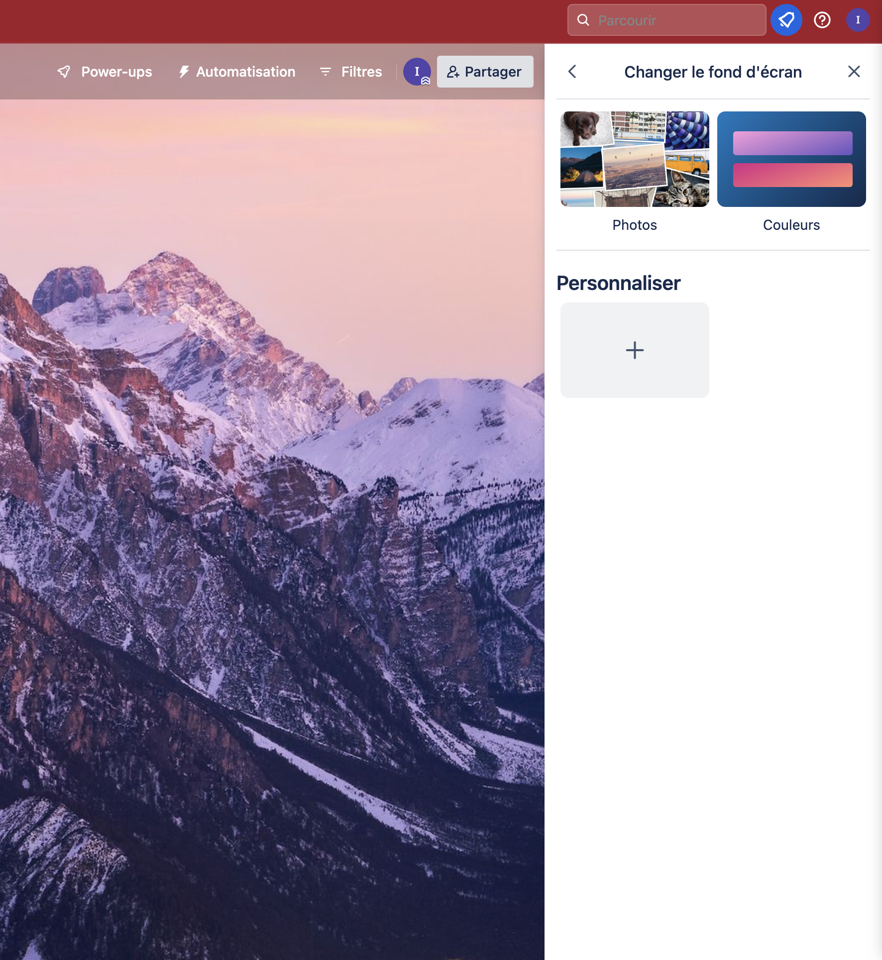
Trello, for example, applies this effect by prompting users to change their board background image to feel more "personal".
📖 #44 Storytelling Effect
People tend to remember stories better than facts alone. In UX, this principle is known as the Storytelling Effect, where narrative elements are strategically placed in the design, using narrative elements, like engaging stories, to enhance the user's interaction with a product or service.
Knowing how to tell a good story in a digital experience makes people care more and get more into it. Stories make abstract ideas clear and simplify complicated messages.
Additional readings and resources

